|
J. M. Pescado
|
EA didn't copyright the plumbob, did they? That might be a good alternative. They can't, in any event. Our usage of it is a legitimate work of parody and review. |
|
|
|
|
 Logged
|
Grant me the serenity to accept the things I cannot change, the courage to change the things I cannot accept, and the wisdom to hide the bodies of those I had to kill because they pissed me off.
|
|
|
|
Baroness
witch
Breakfast of Champions!
Senator

Posts: 11638
Shunning the accursed daystar.

|
You've been sussing this copyright shit out, haven't you?  |
|
|
|
|
 Logged
|
My fists are named Feminine and Wiles.
|
|
|
|
BastDawn
|
This one is not a transparent image, but it doesn't need to be. It's the correct size for a vertical t-shirt design, and is technically well done. If others have been working on this image as well, variants will still be accepted. 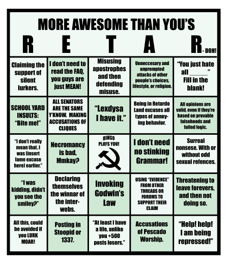 |
|
|
|
|
 Logged
|
|
|
|
|
J. M. Pescado
|
It's also an obvious knockoff of the original webcomic version, so ixnay on that.
|
|
|
|
|
 Logged
|
Grant me the serenity to accept the things I cannot change, the courage to change the things I cannot accept, and the wisdom to hide the bodies of those I had to kill because they pissed me off.
|
|
|
|
Marchioness
rohina
Horny Turkey
Grammar Police

Posts: 14042
"So MEAN!"

|
Also, previous version was funnier.
|
|
|
|
|
 Logged
|
|
|
|
|
|
|
Assmitten
|
This is a tricky one. I love the Retardo cards, but it might be too small on a mug and if it's on your teeshirt, you know that mouthbreathers are going to want to lean in way too close to read the little boxes. And if your shirt is hard to read, then what's the point?
Might work well on a mousepad!
|
|
|
|
« Last Edit: 2008 September 09, 03:32:47 by Assmitten »
|
 Logged
|
<notovny> Aww, yeah, WOODBEAST.
<kutto> Keep it in your pants, notovny.
|
|
|
Solowren
Senator

Posts: 2176
A flock of crapped nerds

|
Ooh, do want mousepad! I could keep pennies around on my desk, and whenever a Tard shows itself, I can have a quick go at some Re-Tar-Doh!
|
|
|
|
|
 Logged
|
|
|
|
Yecats
Dimwitted Dunce

Posts: 197

|
Make it a laminated dry-erase mouse pad and all you need is a whiteboard marker.
|
|
|
|
|
 Logged
|
ENTP = Mad Scientist. Muwaahaahaa.
|
|
|
|
jfade
|
FFS shirt for the win, and I'd totally buy a mousepad with the RETAR-doh! bingo card on it.
|
|
|
|
|
 Logged
|
  Nifty Sims hacks and programs at: DJS Sims |
|
|
|
BastDawn
|
MOAR submissions! These two are hand-drawn pencil sketches, submitted as JPG files. I disapprove of JPGs because they always have image quality degradation; if you can't manage a PNG, send me a BMP instead and I'll convert it. The size is also too small -- only 1600x1219 pixels, and that includes all the empty space around the image. The edges of the text look bad due to the data loss from the JPG format, and it's only going to get worse if the image has to be sized up. I don't approve of the lack of contrast on the black image, either; it's too hard to see the image. On the plus side, the artist tells me that it will probably be re-entered in better quality later. Now is a great time to tear it apart to encourage a better incarnation! 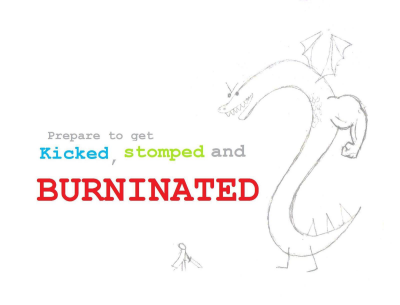 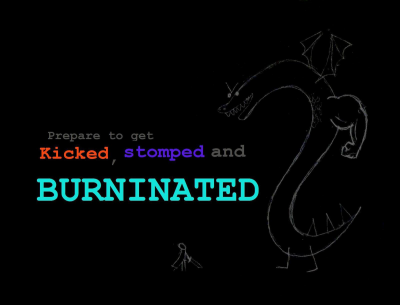 I suggest thicker, completely solid lines in gray #808080 for contrast on both white and black, with everything scanned in larger, on a transparent background (allowing the same image to be used on both black and white) and PNG FORMAT! |
|
|
|
« Last Edit: 2008 August 29, 22:30:19 by BastDawn »
|
 Logged
|
|
|
|
|
BastDawn
|
I'm double posting because this is a separate entry by a different person. However, it has all of the same problems as the previous entry: too small (this is FULL SIZE!), crappy JPG with obvious image degradation, and too small for a t-shirt, mousepad, or anything other than a coffee mug or sticker. Did I mention that it's too small? Screenshots don't make good shirt images!  Edit: I've been informed that there is a much larger, better version of this sitting on the artist's hard drive. It is not on MY hard drive. Be forewarned: technical judgment is passed on what I actually get! If I get the good version, I will post a new review. |
|
|
|
« Last Edit: 2008 August 26, 02:11:40 by BastDawn »
|
 Logged
|
|
|
|
hippi
Corpulent Cretin

Posts: 121
ISFP

|
So far I think the FFS logo is my favourite.
|
|
|
|
|
 Logged
|
|
|
|
|
Duchess
sloppyhousewife
Lipless Loser
  
Posts: 691
Plumber Zombie

|
I'd totally buy a "Have you arr'd today" coffee mug and a TSR t-shirt.
|
|
|
|
|
 Logged
|
"Getting attention here is like awakening Lovecraftian cosmic horrors. Don't do it." - J.M. Pescado  |
|
|
|
BastDawn
|
|
|
|
|
« Last Edit: 2008 August 27, 02:20:44 by BastDawn »
|
 Logged
|
|
|
|
|
|
Solowren
Senator

Posts: 2176
A flock of crapped nerds

|
I love that one!
|
|
|
|
|
 Logged
|
|
|
|
|
msalwaysright
|
Nice!
I really like the soup one too, especially on a coffee mug.
|
|
|
|
|
 Logged
|
"Proper capitalization is important, SimplyComplex. As you will know if you have ever had to help your uncle Jack off a horse."~Jack Rudd
|
|
|
|
Marchioness
rohina
Horny Turkey
Grammar Police

Posts: 14042
"So MEAN!"

|
Soup mug is excellent. I also like the spork.
|
|
|
|
|
 Logged
|
|
|
|
Jelenedra
The New "Gay"
Whiny Wussy
    
Posts: 7582
Evil Mastermind BehindTorturing Emo 12s

|
Why a spork, cousin? Why not a knife... or fork?
|
|
|
|
|
 Logged
|
 | Why are all these damn hippies on my website?
We are on your forum, taking over your world and making your children gay. |
|
|
|
|
BastDawn
|
Why a spork, cousin? Why not a knife... or fork?
*BastDawn sporks JelenedraNew stuff! These are coffee mug designs. The size is good and the technical quality is high.  ---------------------------  --------------------------- 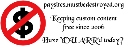 |
|
|
|
|
 Logged
|
|
|
|
rufio
Non-Standard
Uncouth Undesirable
   
Posts: 3030
More Nonstandard Than You


|
I would totally buy the Macro->Caffeinate cup, except that it's missing the e, which is not awesome.
|
|
|
|
|
 Logged
|
I was thinking about these things and I am a feminist.
 |
|
|
|
msalwaysright
|
I would totally buy the Macro->Caffeinate cup, except that it's missing the e, which is not awesome.
No, it's spelled correctly. The noun caffeine, and the adjective caffeinated, have the 'e', but the comical verb, caffinate, doesn't. It just doesn't look right. |
|
|
|
|
 Logged
|
"Proper capitalization is important, SimplyComplex. As you will know if you have ever had to help your uncle Jack off a horse."~Jack Rudd
|
|
|
rufio
Non-Standard
Uncouth Undesirable
   
Posts: 3030
More Nonstandard Than You


|
Well, Caffinate with just the i looks wrong to me, and dictionary.com thinks neither is a word. I guess it depends on how JMP spelt it in-game, and off-hand I can't remember.
ETA: I just checked, and it is spelled with the e in the rtfm.
|
|
|
|
|
 Logged
|
I was thinking about these things and I am a feminist.
 |
|
|
|
BastDawn
|
*waves hand mysteriously These are not the spelling errors you are looking for. (The artist sent me the fix.)New stuff! Large size, black text on the one item can easily be switched to white for printing on black, and thus both meet my expectations. 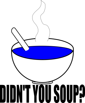 -------------------------- 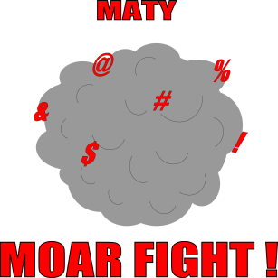
|
|
|
|
|
 Logged
|
|
|
|
|


